About
The SJS Brand
Logos
SJS Investment Services
The SJS logo represents the visual identity of SJS Investment Services. Using this mark correctly, along with the family of brand elements and colors, reinforces a consistent image and position in the marketplace.
The Lockup

Clear Space
The logo will look its best with ample breathing space, or clear space, around the mark and logotype. The clear space unit is based on the visual square formed by the height of the tallest rectangle in the logomark. Please refer to the diagrams below for clear space guidelines.

Violations
Do not modify or change the SJS logo. Make sure the logo is placed on a branded color or white background. The registered trademark should always appear on the logo.


MarketPlus® Investing
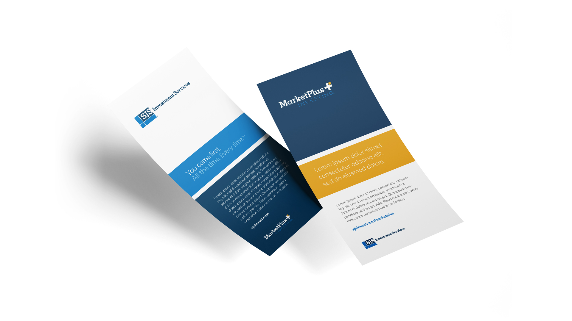
The MarketPlus® logo should generally exist as subordinate to the SJS logo to provide clarity of brand. In the event that MarketPlus® Investing is the focus of the content, it would replace SJS as the priority and the hierarchy would reverse. Both logos should never be presented at the same level or size. The MarketPlus® Investing logo should never be presented without visible SJS brand representation.
Lockups


Hierarchy Examples
Colors
SJS Investment
When using color across a variety of media, it is important to remember that there will be differences. No color match is exact. Work closely with your vendor to get the best result possible. Pantone Colors are the best standard for exact color matching because CMYK numbers can change based on the paper and printing process.
MarketPlus® Investing
Typography
Type is a vital component of the overall visual identity and a recognizable indicator of what the brand represents and what it’s saying to its audience.
Primary Typeface
Gibson
Gibson is a humanist sans serif typeface designed by Canadian type designer Rod McDonald, and produced by Patrick Griffin and Kevin King of Canada Type.
Gibson should be used for headlines, subheads and body copy. Hierarchy is achieved by varying different weights and sizes.


Substitute Typeface
Tagline
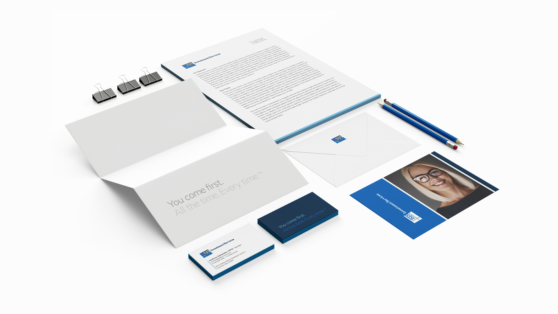
The SJS tagline can be used in a variety of ways, but should always be set in Gibson Book for consistency. In most cases, using one of the supplied vector formats is advised. Emphasis should be placed on “You come first” through color and tint. Stacking the tagline is allowed, but should always follow the approved formula shown below.


Reversed Options


Photography
Staff Shots
Representing the SJS team is vital to the overall brand strategy. Team members are the first point of contact with clients and are essentially SJS brand ambassadors. Staff photography should remain consistent by controlling the background and lighting accordingly. Shooting in studio is recommended.
Team Profiles


Team Working


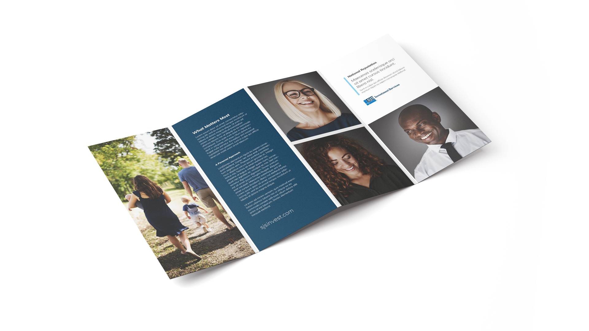
Client Shots
Client photography should reflect an authentic take on our shared values and interests. These lifestyle shots should be taken on location in a candid or journalistic style.


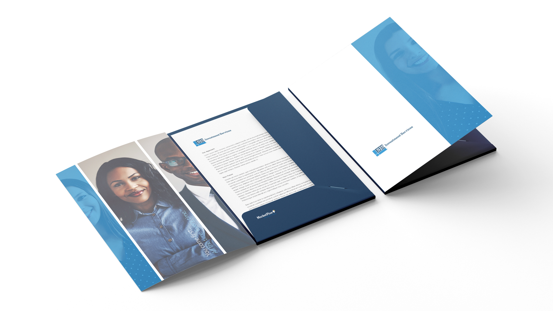
Application